
TELECONSULTATION MOBILE APP
MyCLINIC APP
The MyClinic app is designed to make it easy to access healthcare services through teleconsultation, chat with medical professionals, and a support center. It's made for remote employees in areas like mining and their families. They often struggle to get timely and quality healthcare services. The challenge was to make a user-friendly interface that lets patients book appointments, chat with healthcare providers, and get support quickly. The main goal was to make sure the app meets the needs of diverse users, including those with different levels of technical skill and healthcare needs.
Objective
Provide seamless access to healthcare
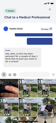
Teleconsultation
Medical Chat
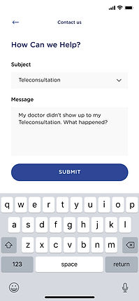
Support
Target Users
Remote employees in areas like mining and their families
Challenges
-
Difficulty accessing timely, quality healthcare.
-
Need for an intuitive, user-friendly interface.
-
Accommodating users with varying technical skills and healthcare needs.
TEAM COMPOSITION
Me as a
Lead UX Designer
managed a team of
02 Designers &
08 Development vendors
TIMELINE
08
months
PLATFORMS
USERS
Seamlessly Stepping In
Leveraging Existing User Insights and Defined Personas
David
Mining Engineer |
42
Needs
Accessible healthcare solutions due to remote work.
Behaviors
Prefers straightforward, efficient communication.
Sarah
Mining Site Nurse |
30
Needs
Quick access to medical consultation for on-site emergencies
Behaviors
Values reliability and timely response from healthcare providers.
Mark
Mining Site Manager |
50
Needs
Coordination of healthcare for his team in remote location
Behaviors
Seeks ease of scheduling and effective communication tools.
Emily
Family member |
35
Needs
Healthcare support for family members who are unable to access urban healthcare facilities easily.
Behaviors
Values clear information and reassurance about the quality of care provided.
IDEATION
With my understanding of the users and personas, I began to focus on identifying the problems we need to solve for them. By analyzing the insights and needs gathered from the research, I delved deeper to gain a clearer understanding of the users' issues. This involved creating point-of-view (POV) statements and How Might We (HMW) questions, which guided my brainstorming process.

I brainstormed with key stakeholders to develop the "How Might We" (HMW) questions, facilitating a collaborative session to gather diverse perspectives and insights. We used dot voting to prioritize the most impactful ideas, ensuring that the solutions aligned with the stakeholders' vision and the users' needs.
.png)
PRODUCT ROADMAP
I collaborated closely with the Product Owner, key stakeholders, and developers to finalize the feature set. This collaborative effort ensured a balanced approach between business objectives, technical feasibility, and user needs, guiding the development of a cohesive product roadmap. By integrating perspectives from across teams, we optimized the user experience while aligning with overarching business goals and technological capabilities.
This will take you to the Airtable page. Opens in a new tab.
APPLICATION MAP
Now that I knew which solutions I would be moving forward with, I wanted to understand how these new features would fit into the existing architecture of the application. In order to get a better understanding of this, I created an application map.
This will take you to the Airtable page. Opens in a new tab.

TASK FLOWS
Now that I knew how these new features would fit into the existing structure, I wanted to explore how the user’s would be interacting with these new features to complete key tasks. I first created a UI Requirements document to identify the key tasks based on our user’s goals, and then clearly laid out the specific requirements for each screen in order for the user to successfully complete those tasks.
Using the same key tasks, I created task flows to understand the actions the users would take and the key pages they would interact with to complete those tasks.
This will take you to the Airtable page. Opens in a new tab.

Think these methods of IA and task flow presentation are old-school?
You might think these table formats are old-school, but they're tried and true for a reason! At our company, these structures were chosen because they fit seamlessly with our team's workflow, linking perfectly with tools like Jira and Confluence."
Reasons for Using This Format:
-
Team Comfort: Our teammates are familiar and comfortable with this structured format.
-
Integration: It integrates smoothly with our project management tools like Jira.
-
Documentation: Easy to document and share across teams using Confluence.
PROTOTYPING
SKETCHING
Using everything I learned throughout this phase, I then worked on creating lofi wireframe sketches to make informed decisions on how to design these new screens to help our users complete these tasks and meet their goals.
PROTOTYPING IN FIGMA
Using everything I learned throughout this phase, I then worked on creating lofi wireframe sketches to make informed decisions on how to design these new screens to help our users complete these tasks and meet their goals.


This will take you to the Figma file. Opens in a new tab.
STRATEGY AND SOLUTIONS
As the lead UX designer, I encountered several hurdles during the design process and developed creative solutions to address them:
Limited Connectivity in Remote Areas
Solution Implemented offline capabilities within the app, allowing users in remote locations with limited or no internet connectivity to access basic functionalities such as viewing previous messages and appointments. Offline mode synced data automatically when the device regained connectivity.
Complex Appointment Scheduling Needs
Solution Introduced a flexible scheduling system that accommodates varying shift patterns and time zone differences common among remote employees. This allowed users to select appointment slots based on their local time zones and provided reminders tailored to their specific schedules.
User Engagement and Trust
Solution Implemented personalized notifications and reminders to increase user engagement and trust in the app's reliability. Notifications were tailored to remind users of upcoming appointments, updates from their healthcare providers, and timely health tips relevant to their conditions or concerns.

